Logos Ads: From Flashy Icons to Emotional Symbols — What Modern Brands Need to Know
When was the last time you were drawn to a product just because the logo felt right? That’s the silent power of logos ads. It's not just about aesthetics—it's about identity, psychology, and storytelling wrapped into a tiny, scalable image.
In this article, we’ll unpack how logos ads have evolved, why minimalism took over, how AI is disrupting logo design today, and what small brands (like yours and ours) should keep in mind when crafting their own.
What Are Logos Ads?
Logos ads refer to advertising visuals that prominently feature a brand’s logo—sometimes even relying solely on the logo itself to trigger recognition, emotion, or trust.
This isn’t just a Nike swoosh situation. From local coffee shops to new DTC brands, logos ads aim to say: “This is who we are,” in the most condensed form possible. They blur the line between branding and marketing—essentially becoming identity-driven advertisements.

Why Were Old Logos So Flashy?
Let’s rewind to the '80s and '90s.
Back then, the market was still uncluttered. You didn’t have to scream to be heard—you had to dazzle. Many logos used gradients, shadows, 3D effects, and ornate borders. Think early Apple rainbow logo, WordArt aesthetics, and loud color palettes.
Why?
- Fewer competitors on the shelf
- Visual novelty attracted eyeballs
- Flashiness = modernity
But as markets got saturated and consumer taste matured, these effects quickly aged—and began to signal cheapness rather than innovation.
The Shift Toward Minimalism in Logos Ads
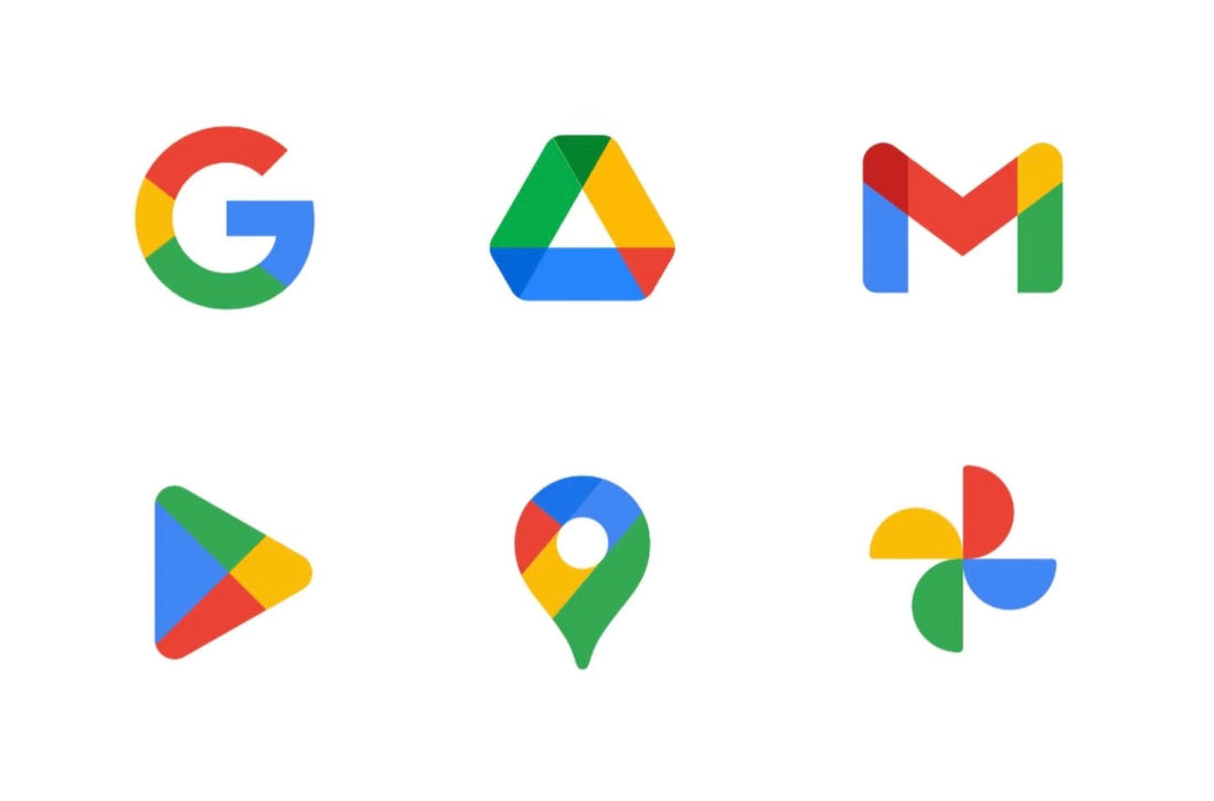
In the last 15 years, especially after the 2010s, major brands began simplifying their logos. Google’s 2015 redesign is the textbook example. The serif typeface became a clean, geometric sans-serif—modern, friendly, and scalable across all devices.
Here’s why minimalism became the new norm:
- Digital-first design: Logos had to look good on 20px app icons and 4K billboards.
- Brand flexibility: A simple logo adapts to seasonal campaigns, animations, and collabs.
- Consumer fatigue: Less is more when everything’s screaming for attention.
Common Elements Used in Logos Ads Today
Even though minimalist aesthetics dominate the branding world today, truly effective logos ads don’t succeed just because they’re “clean”—they succeed because they rely on timeless visual principles that work across time, culture, and medium. Let’s break these elements down to see why they matter:
1. Strong Silhouette
A strong silhouette allows your logo to be instantly recognizable even without colors, effects, or fine detail. Think of the Apple logo, the McDonald's arches, or the Nike swoosh—each is distinct enough to stand alone as a black shape on a white background. This matters in logos ads because your logo might appear in low-resolution, tiny social icons, monochrome print, or as embroidery on fabric. A memorable shape ensures consistent brand recognition in any context.
2. Scalability
Scalability ensures that your logo maintains its clarity, legibility, and impact whether it’s displayed on a billboard or as a favicon. In the world of logos ads, this means a design must survive both massive LED screens and 16-pixel app icons. Brands that ignore scalability often find their logos become cluttered or unreadable when resized, reducing effectiveness in paid ads, merchandise, and social sharing.
3. Color Psychology
Colors aren’t chosen at random. They evoke emotion and signal intent. A blue logo (think Facebook or LinkedIn) evokes trust and stability. Red can communicate excitement or urgency, often used in food brands like Coca-Cola or KFC. Green suggests wellness and calm (Whole Foods, Spotify), while black indicates sophistication and luxury (Chanel, Apple in some cases). In logos ads, color becomes a silent language—triggering subconscious decisions before the user reads a single word.
4. Typeface Personality
Fonts speak volumes even when the words are the same. A serif font (like Times New Roman) feels traditional, rooted, and credible—ideal for heritage brands or institutions. Sans serif fonts (like Helvetica or Google’s current font) are modern, accessible, and clean. Meanwhile, custom-designed typefaces create an exclusive feel, helping brands stand out and guard their uniqueness. When done right, a logo’s typeface aligns with your brand’s voice and enhances visual memorability in logos ads.
5. Negative Space & Symbolism
Great logos hide secrets in plain sight. The FedEx logo’s arrow between the “E” and “x” subtly communicates forward momentum. Amazon’s smiling arrow from “A” to “Z” signals joy and wide selection. These clever design moments create a “wow” factor—turning casual observers into loyal fans. In logos ads, this embedded symbolism adds storytelling layers, making the logo more than a graphic—it becomes a conversation starter.
Are Logos Ads Still Effective in the Age of AI?
Absolutely—but the landscape has fundamentally shifted.
With powerful AI tools like Midjourney, DALL·E, and Logojoy, creating a visually appealing logo is no longer a privilege reserved for professional designers or large-budget brands. Anyone with a few prompts can now generate something “cool” in seconds. In fact, we’re entering a new era where aesthetics are abundant—but meaning is scarce.
Here’s the twist: the real value of logos ads isn’t in how they look, but in what they represent.
In a digital world overflowing with polished, AI-generated visuals, logos that truly work aren’t the ones that look the most stylish—they’re the ones that feel personal, intentional, and alive.
The logos that resonate in this era tend to:
- Evoke emotional response – They don’t just decorate, they connect.
- Communicate core values – Authenticity now matters more than perfection.
- Adapt and evolve – Strong logos can morph with the brand’s growth, storytelling, and digital context.

AI Has Flattened Aesthetics—But Raised the Bar for Meaning
AI has democratized access to beauty. You no longer need design skills to create something sleek. But because of that, “good-looking” is no longer a differentiator. When everyone has access to perfect gradients, elegant fonts, and symmetrical compositions, what sets your logo apart is its soul—the narrative, values, and intention behind it.
That’s where logos ads step into new territory.
Modern logos ads must go beyond showcasing a static symbol. They must function as emotional carriers, showing up in movement, embedded in video content, animated as part of a story, and lived out through user-generated content, avatars, and product design.
Logos Ads Are No Longer Static—they’re Ecosystems
A logo used to be a badge. Today, it’s a living system. It breathes across social media headers, app icons, product packaging, TikTok videos, and online communities. The most powerful logos ads of today are not just well-designed—they are felt. They are extensions of identity, both for the brand and for the people who align with it.
So yes—logos ads are more relevant than ever.
But their success now depends less on how well they were made, and more on why they were made.
Case Study: Google’s Logo Redesign Logic
Google’s 2015 redesign wasn’t just aesthetic.
It reflected:
- Cross-platform needs: From watches to Chromebooks.
- Global friendliness: Soft geometric letters feel more inclusive.
- Technical optimization: Faster loading, better rendering, accessibility-friendly.
This move signaled a broader shift in logos ads: utility + emotion > ornamentation.
What Should Small Brands Keep in Mind When Designing Logos Ads?
You don’t need a million-dollar branding agency to make a great logo ad. But you do need intentionality.
Here are 5 questions to guide your design:
- What emotion do I want my logo to trigger?
- Will this still make sense in 5 years?
- Does it look good in black & white?
- Can it adapt to video, print, and packaging?
- Is it me, or just trendy?
And finally, don’t overdesign. A confident brand doesn’t shout. It whispers clearly.

Logos Ads in 2025: Meeting Psychological & Emotional Needs
We live in an age of identity performance. Logos are not just about selling—they’re about belonging.
When someone wears your logo on a T-shirt or clicks your icon on an app, they’re saying:
“This says something about me.”
That’s your north star: build a logo ad that feels personal. That reflects your truth. That welcomes others into your world.
And remember: you can always evolve it later. Even Google did.
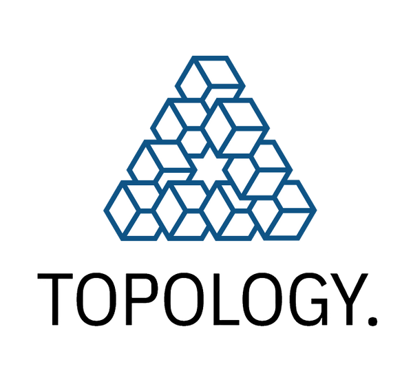
💡 Practical Tip: Apply This to Your Own Brand
When building your own fashion brand, these principles aren’t just theoretical—they’re highly actionable. Take our own logo at Topology Clothing as an example.
From the start, we designed it with intention: a precise, geometric shape that reflects clarity and structure—perfectly aligned with our values of durability and simplicity. The blue color we chose wasn’t just for aesthetics—it conveys a sense of cleanliness and order, while also echoing the technological undertones of the AI-driven design era we’re part of.
This approach made our logo more than just a mark. It became a signal—of reliability, relevance, and vision. That’s the kind of emotional clarity every small brand should aim for in their logos ads.